An End-to-End Monthly Revenue KPI Dashboard
A stakeholder-ready Tableau dashboard tracking revenue, total trips, ride duration, and station performance — giving bike-share operations teams a single source of truth for monthly KPI review.
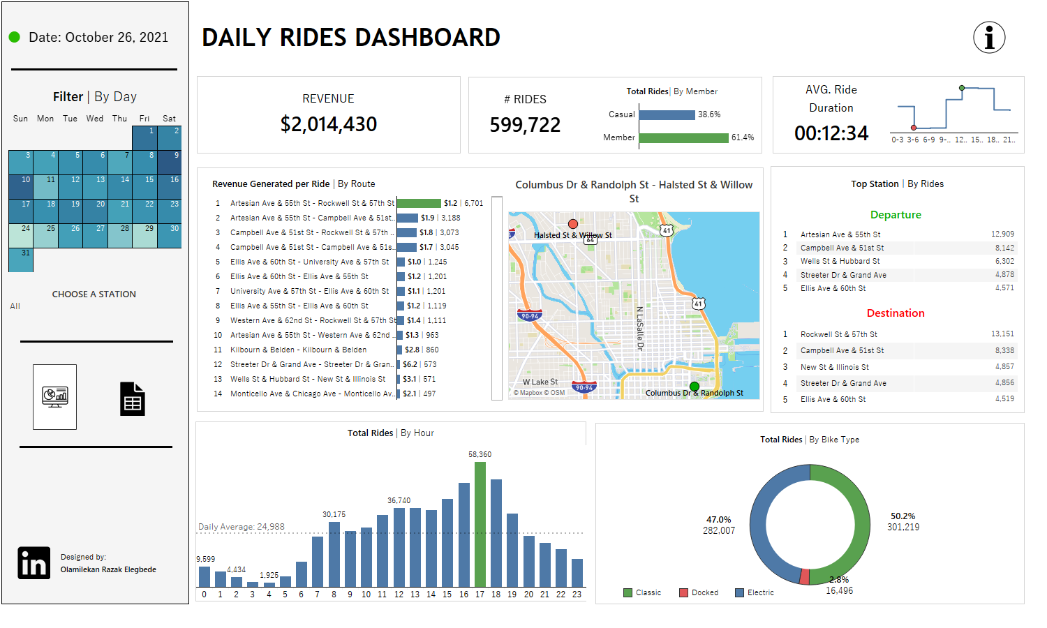
Overview
Operations teams need fast, reliable access to key performance indicators without digging through raw data exports. This project delivers a polished, end-to-end Tableau dashboard purpose-built for monthly KPI review at a bike-share company.
The dashboard surfaces revenue generated, total trip counts, and granular ride details — including average duration, per-station revenue breakdown, and start/end time distributions — in a format designed for both executive review and operational use.
Dashboard Features
Revenue Tracking
Monthly and cumulative revenue is tracked against targets, with trend lines highlighting periods of over- and under-performance relative to the monthly average.
Trip Volume KPIs
Total trips, daily averages, and peak-day counts are displayed in a KPI scorecard format — with month-over-month change indicators for at-a-glance performance assessment.
Ride Detail Analysis
Average trip duration, revenue per trip, and start/end station popularity are broken down to identify the most-used routes and the stations generating the highest revenue.
Time Distribution
Heatmaps and bar charts visualise trip volume by hour of day and day of week — enabling operations teams to align staffing and rebalancing resources with actual demand patterns.
Explore the Dashboard
Interact with the full Tableau dashboard to explore all KPI views.